Presenting Data Intensive Findings
My first position right out of college was that of a Pricing Research Specialist for a supermarket chain. I managed the company’s Price Comparison Index that tracked our prices against competition. The on-going report that I inherited was nothing more than a matrix of approximately 100 indices on a page for each of the store’s food departments. It was ugly. No one in the company had any interest (or understood) the “report” except me, my boss and the president of the company.
I took some time to revamp the report, eliminating most of the numbers and making it an easy read. In a matter of weeks the Price Comparison Index was in high demand with the distribution list going from five to sixty-five and pricing meetings occurring only when my latest report was available. My role in the company changed completely simply by putting a stop to boring and confusing people with too many numbers.
That experience has stayed with me throughout my career. To a large extent, a study is only as good as the presentation. Like a tree falling in the forest with no one there, a lot of good research goes silent and unused because of poor and over reporting. Here are some principles I use in presenting data to avoid death by PowerPoint.
- Even though an average consumer survey consists of 15,000 to 20,000 numbers, keep them to an absolute minimum. Do the heavy lifting of going through all the numbers for your audience and then present meaningful insights instead of data.
- Never forget that you are in research and your audience is not. Don’t try to educate them with the nuances of your field. Use their language. Eliminate unnecessary complexity.
- Try to find a human story within the data. Instead of reporting disconnected facts about a target audience segment, create a “day in the life” profile.
- Keep the presentation short. The State of the Union address is only around an hour.
- It is always better to have less on a slide and more slides than more on a slide and fewer slides.
- Examine each slide for extraneous data, pictures and words and DELETE them.
Here are a few examples of slides that are friendly and memorable.
WORDS AND PICTURES
Research has shown that words with corresponding pictures are more memorable than the words alone or the pictures alone. This slide describes some characteristics of a market segment. There are a few hundred numbers and analysis behind it.

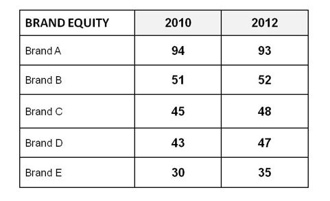
WEAVING DATA TOGETHER
Brand equity scores represent a great way to combine a ton of numbers into one number. A brand equity score in this example considers familiarity, ratings on attributes and the relative importance of the attributes. There are pages and pages of numbers behind this slide.
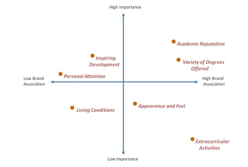
BRAND MAPPING
The name, multidimensional scaling, is enough alone to lose an audience. Eight-dimensional perceptual maps are impossible to communicate on a two-dimensional slide. All that matters in the end is what insights are garnered from the maps. By contract, a lot can be gained and communicated from a simple, more intuitive map like this one for an Ohio university.
This is not a pretty picture but it sure beats showing the reams of data behind it.
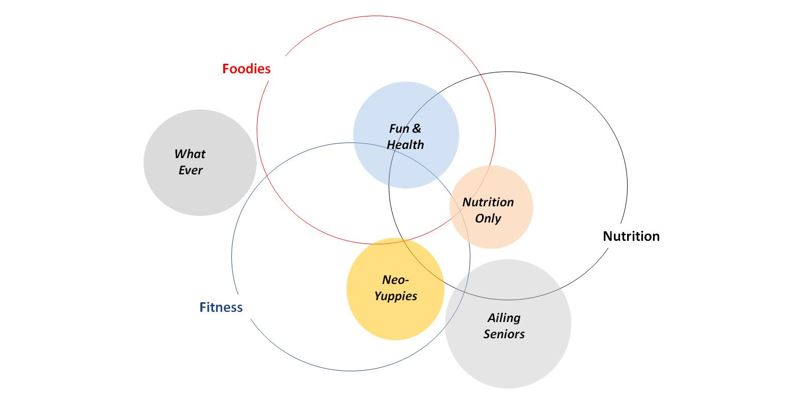
BIGTIME DATA WEAVING
Using concentric circles is a way to create a three-dimensional space on a two-dimensional slide without straining the brains of your audience. This slide shows where five consumer segments land in a space defined by foodies, nutrition and fitness. To once again avoid boring numbers, each segment’s relative size in the market is communicated through the area of their bubble. This visual is the net of a large portion of all the questions asked in a major market segmentation study.
All in all, the best way to present data intensive findings is to eliminate the data. That requires digging in deep and looking for simple ways to connect the dots for others.
“If you can’t explain it simply, you don’t understand it yourself.”
– Albert Einstein